
A common remark I hear among modern women is that their life doesn’t ‘look like instagram’. And more often than not, it’s a complaint.
‘Unrealistic’ white interiors (ouch); perfectly coordinated children (I want things to look nice, but my kids still gotta express themselves, so we get a pass here); tidy homes; and perfect lives. Right?
At this point, I think there’s a large enough movement that we all know that’s not reality—even if the snapshot is ‘real’, it’s only a moment, not indicative of how things always are. But still, as a person with a passion for both interior design, and aesthetics, I know: sometimes you just want things to be how you want them to be. And a lot of the time, that means nice enough to share and feel good.
I don’t have the dream, perfect life (see: bikes in my actual house). We don’t have a big home. I am constantly tidying, thanks to two tornados, and three fuzzy poltergeists. And, looking at my instagram, you probably don’t know that. So, I want to share my tips, as a relatively young—3 years now!—blogger-person, on how to achieve an instagram aesthetic for your own home.
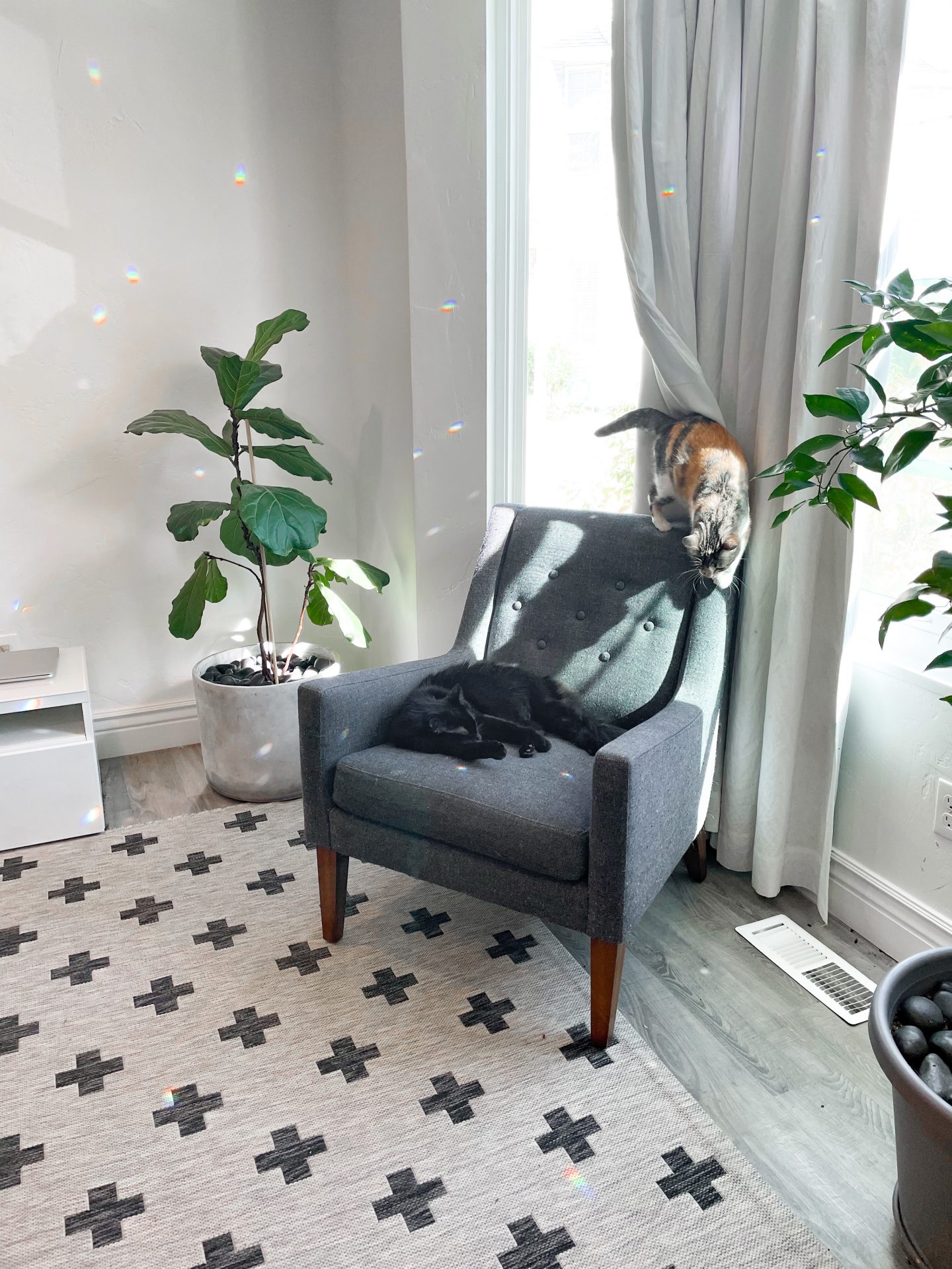
lighting lighting lighting – I wrote it three times, because it’s that important. Find out when the lighting is best in your home, and use that to your advantage when taking pictures of your space, or people. If you really dig through my content, you’ll find many examples where I had to rely more on editing to ‘fix’ pictures. it doesn’t usually work out amazingly. You can only get so far away from your best lighting times before your photos get weird. For my house, 10:30am to Noon is usually the best shot. I can take pictures other times, but the editing is harder, and the result is still less nice. Lighting that is bright and full, but not harsh is what your looking for. And it can be different for different rooms. My living room and dining room have completely different best lighting times. Just take note when you’ve got the brightest, defused light, and your pictures will be so much better.
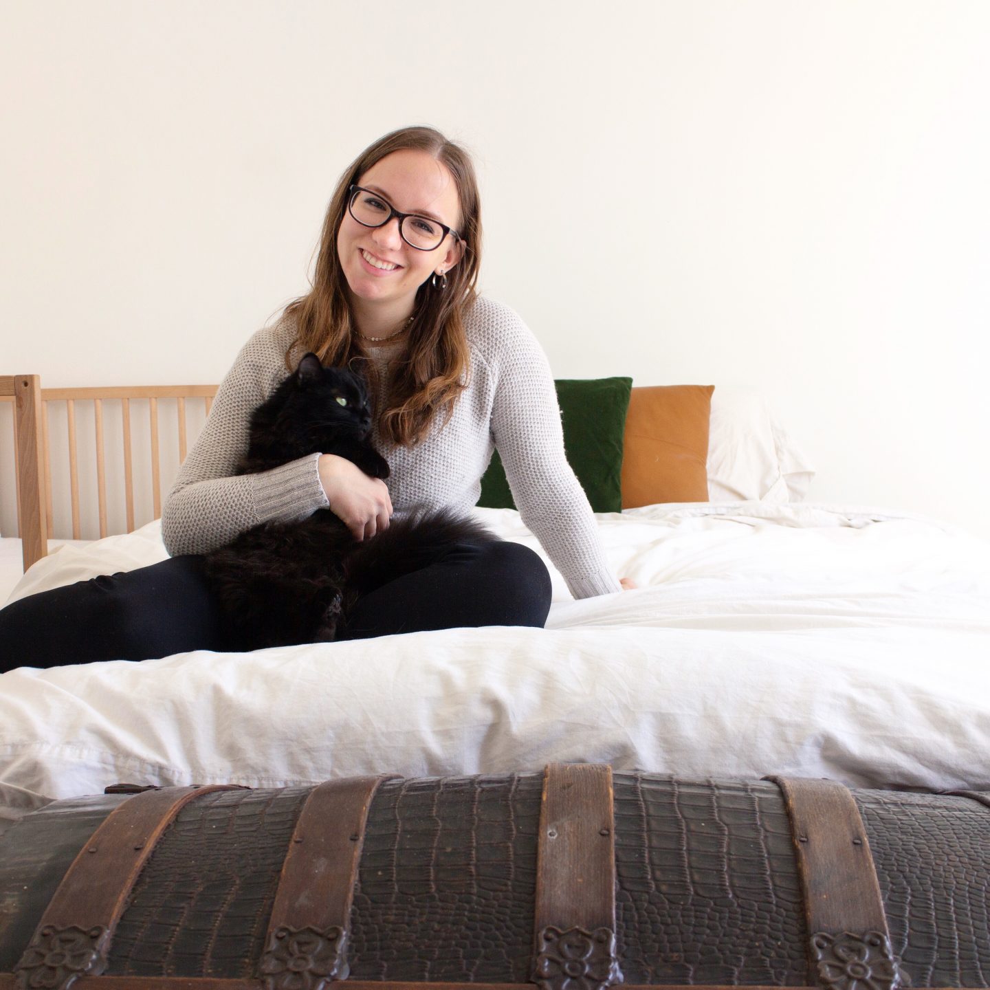

craft your space – this is a big one. Everyone has a different style, and different goals for their home. I love, love, love modern scandi. My particular quirks and minimalist heart prefer white walls with little on them. But there’s no reason that someone with the complete opposite style (maximalists—search it on Pinterest for inspo) can’t have gorgeous pictures. The biggest thing is just to really lean into a style. Budgetary constraints are real, and may prevent you from getting your dream look right now (mine is still not done after 3 years in my home). However, you still may be able to upgrade (not to the dream, but just up) from those extremely overworn 20-year-old brown couches that belong to no style at all. With a vision in mind, you can make your entire space flow together, creating a strong design, and sense of unity. If you are interested in several interior styles, it’s time to pick one. What do you already have that you really like? What do you pin? How do you want your house to feel inside? Picking one direction will feel much more cohesive than a smorgasbord of things.
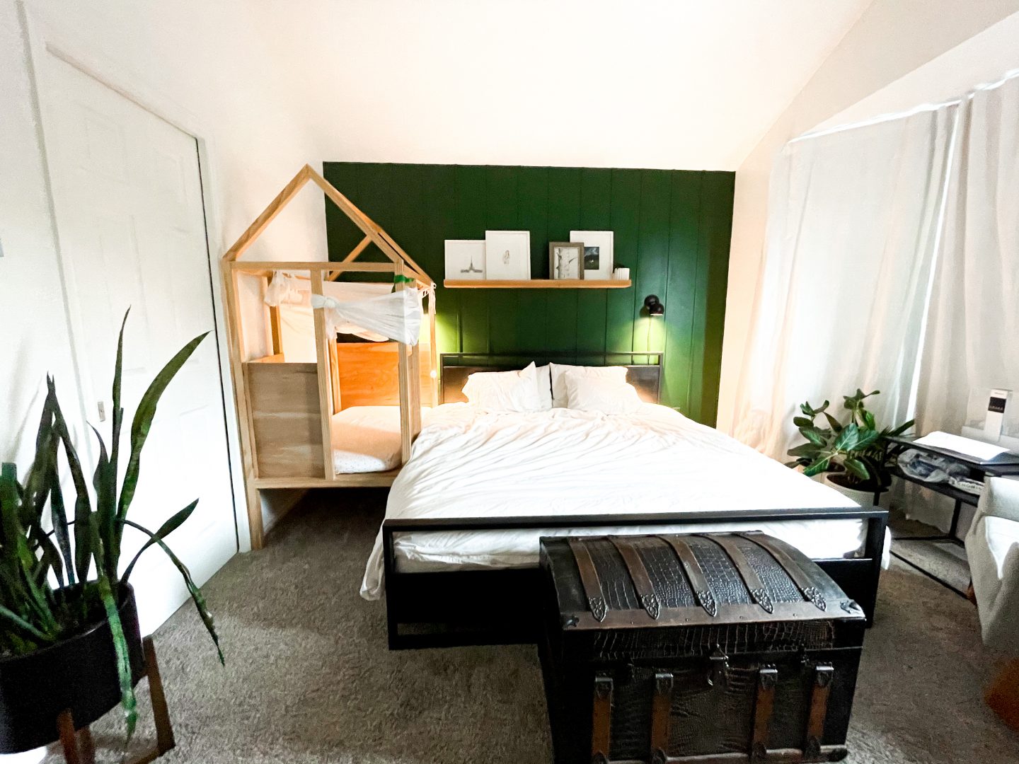
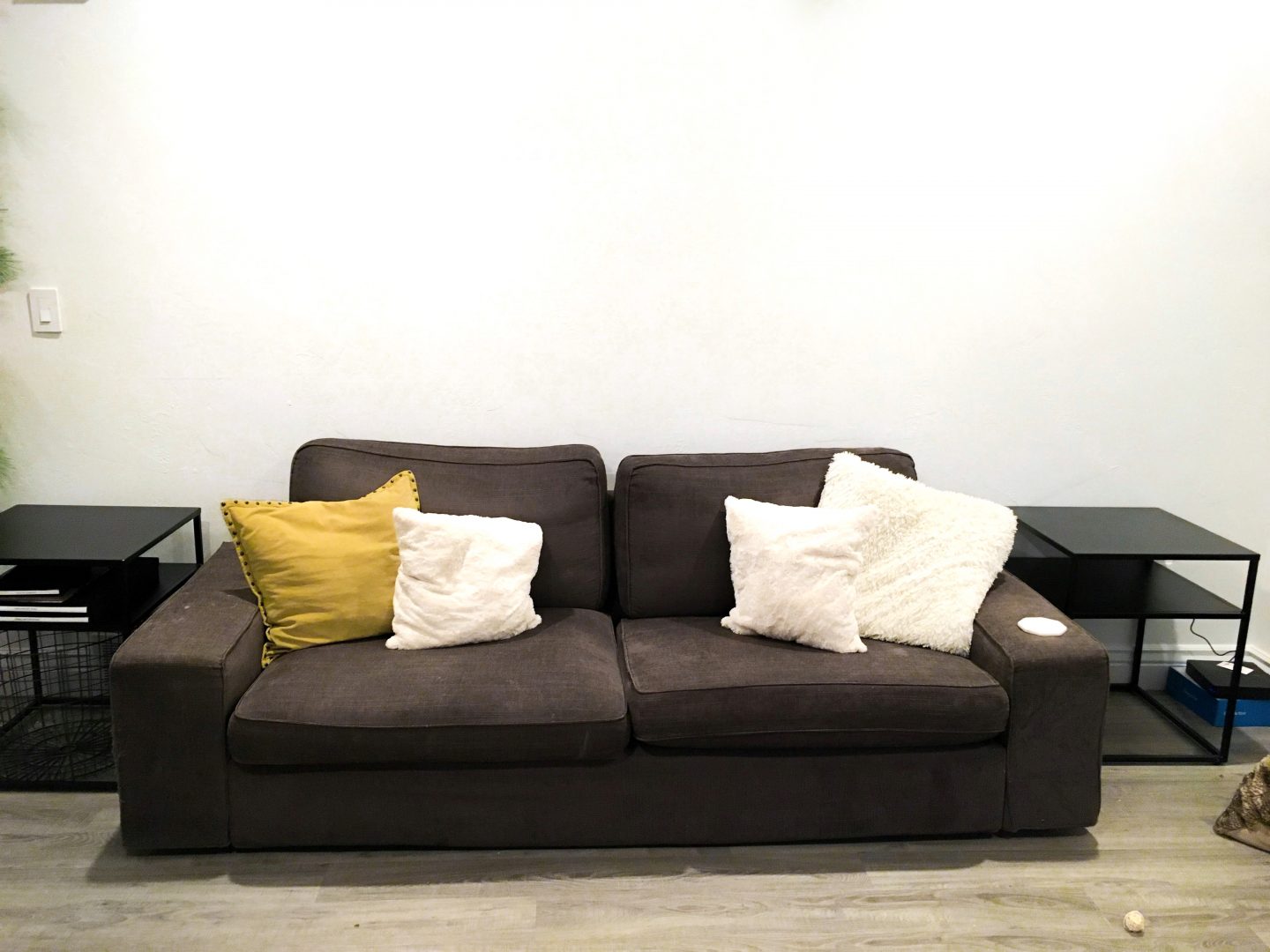
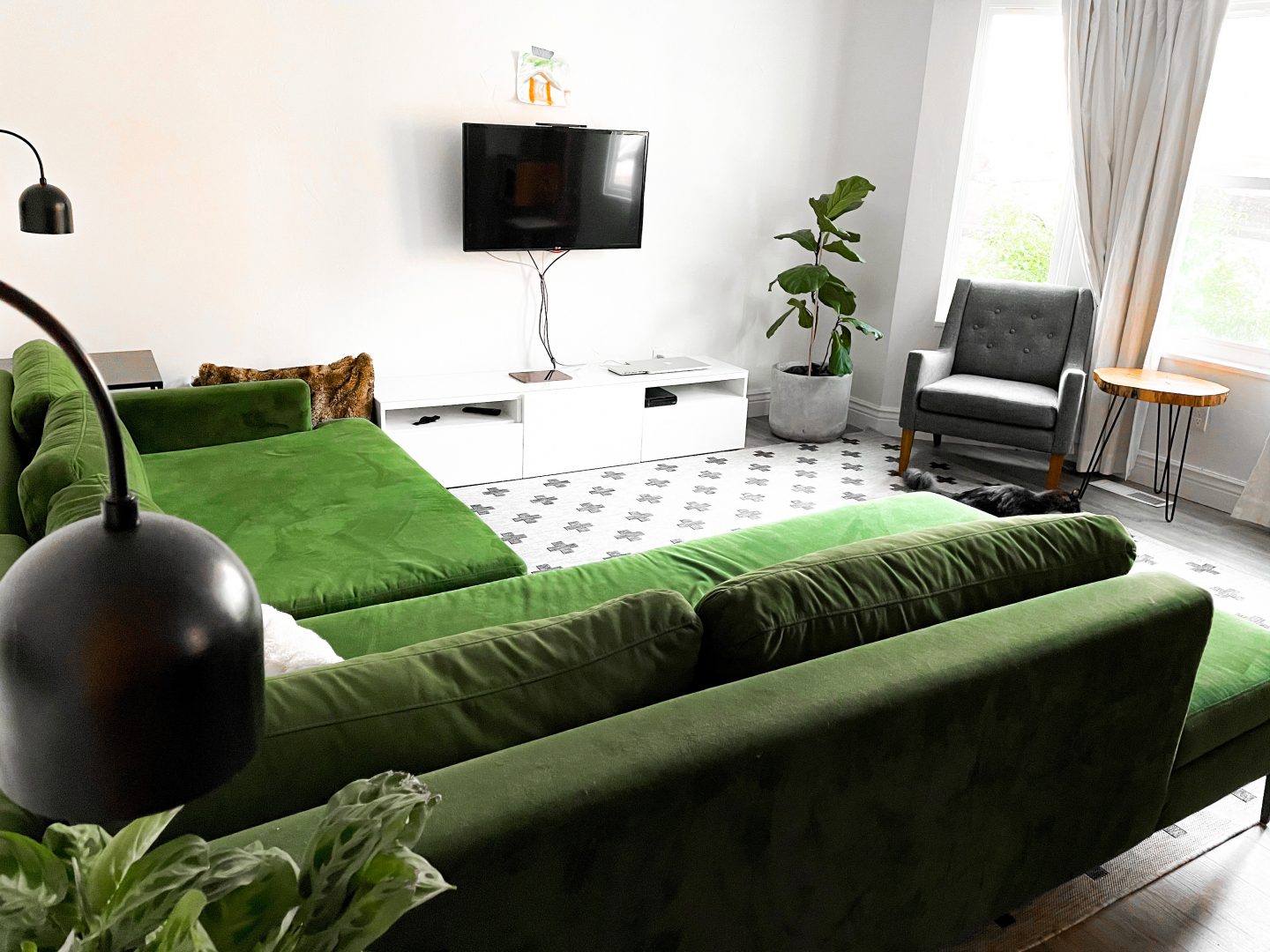
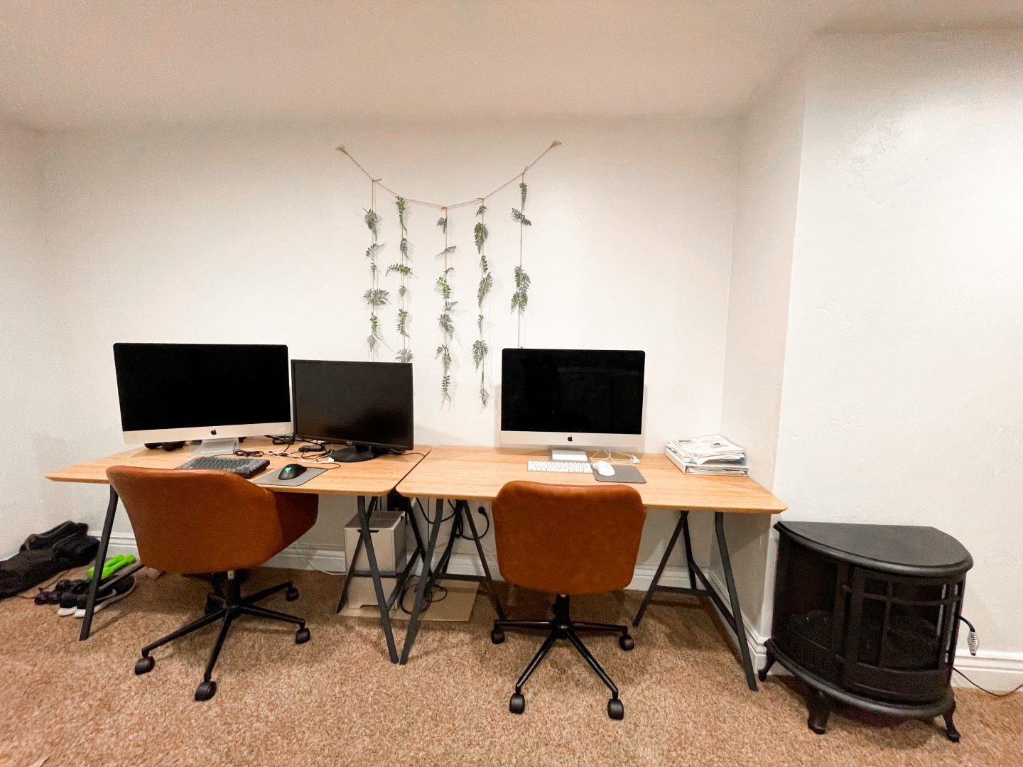
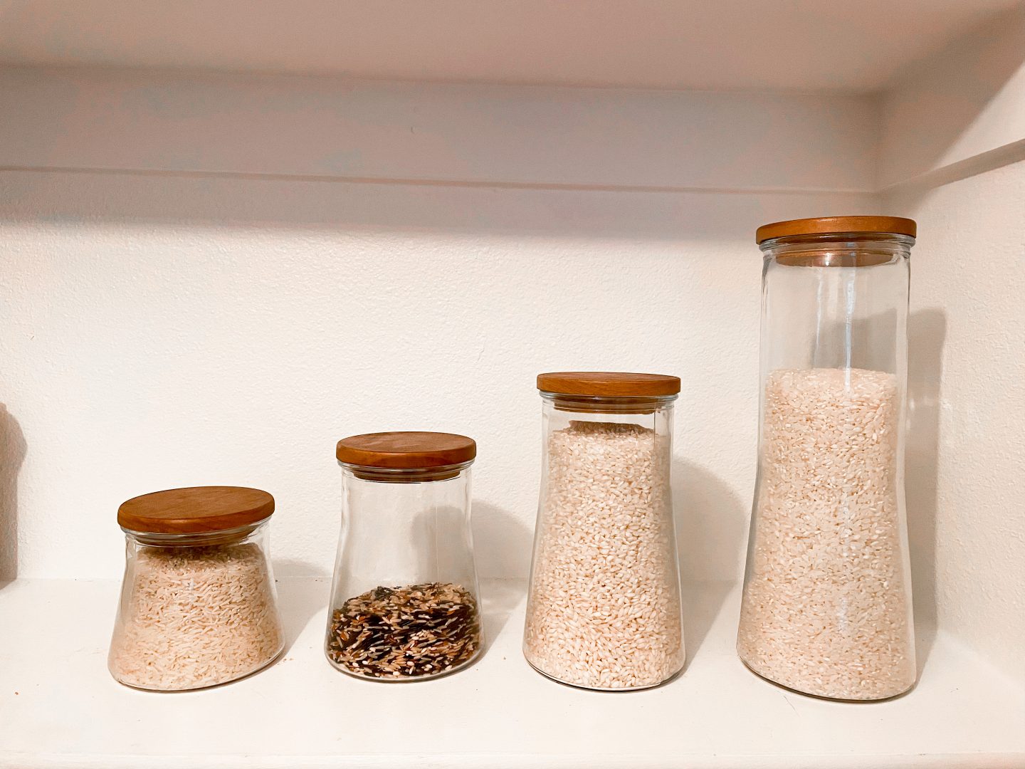
figure out what to do with your stuff – I know, this sounds daunting. Yes, absolutely be my guest and KonMari the heck out of your house. If you want to. But just for the aesthetics, you don’t have to. Make sure everything in your space is living in the best place for it. Get baskets, and bins. Toss things you really don’t need, or find useful or beautiful. Cleaning things out will make a HUGE impact on how things feel. For me, I know that it can be hard to get rid of things you’ve had for a long time. It almost feels, like, a solid fixture of your existence? BUT, I promise, if it’s not doing anything for you, it’ll be okay to let it go. You’re not gong to start using things more in storage. And, for the things on display? Be extra ruthless in deciding what is furthering the ~vibe~ you want, and what is just sort of there, or in the way.
clothes – look, if you’re really intent on a specific instagram-y color scheme, then buy your family clothes almost exclusively in those colors, or complimentary ones. I don’t really do this, but you can if you want to make a really strong color statement, and always have that palate available. Hint: neutrals usually don’t promote or mess up any particular scheme.



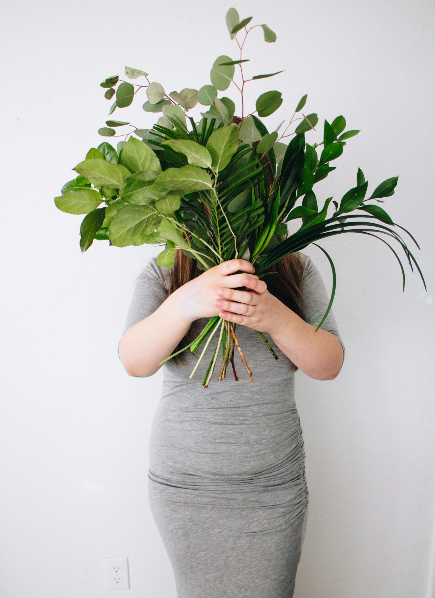
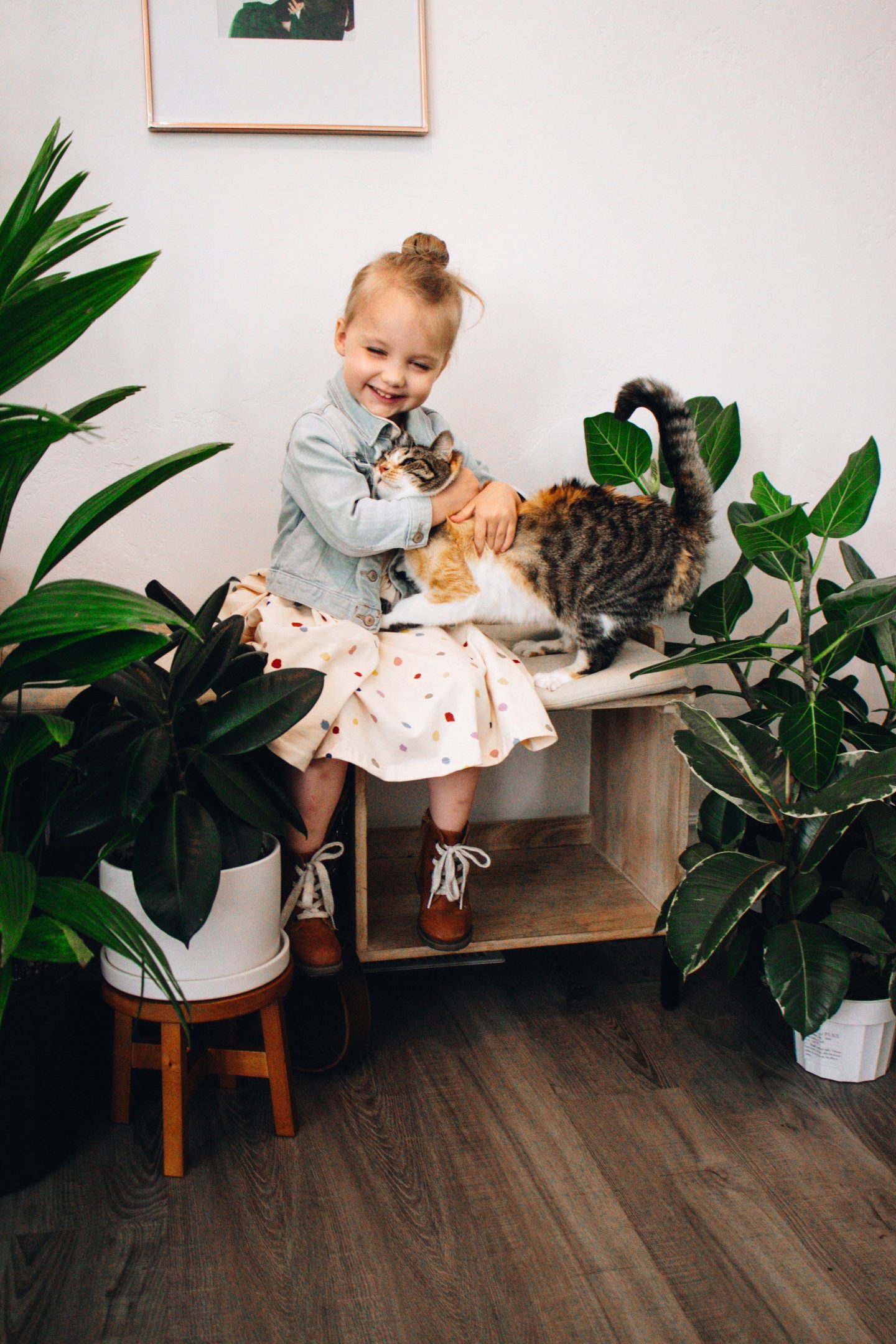
angles and frames – you know the angle that everyone took pictures in the 90’s? Like ever so slightly down? That’s wrong. ha If you want to capture that insta-feel, you’re going to want to be straight on, or level and at an angle; unless you’re going for a more extreme angle in either direction. Keep in mind, symmetrical photo subjects can feel very staged, but also ~perfect~. If you followed my tips above, you should be able to shake things up a bit to show off many areas of your space. Top tip: look for frames, or frames within frames to add extra interest. A frame could be a plant, mirror, or curtain—something that makes the subject (whether couch, or person) look very much a part of the space, and softens the image’s edge. A frame within a frame is, like, a person in a doorway with the whole doorway in shot; it calls attention to the subject.
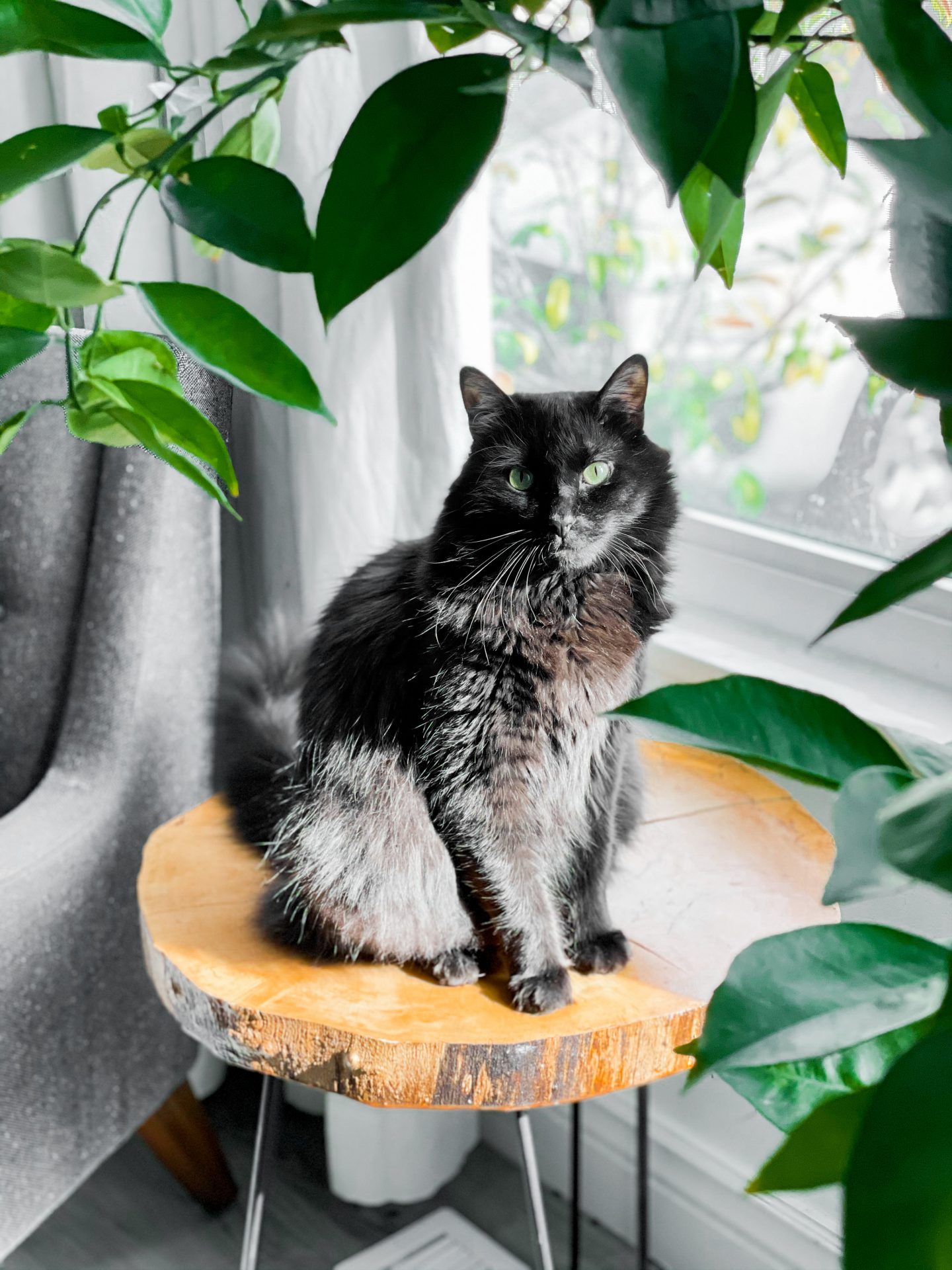
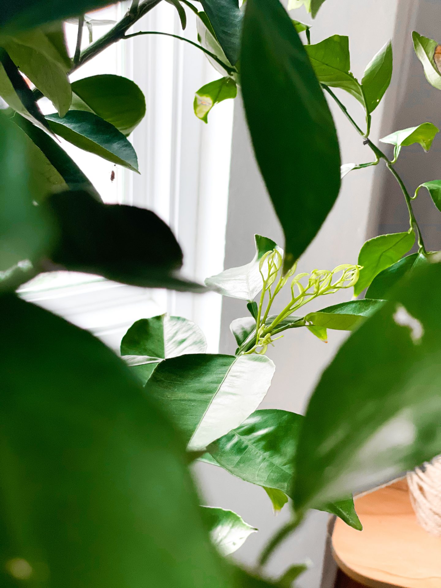
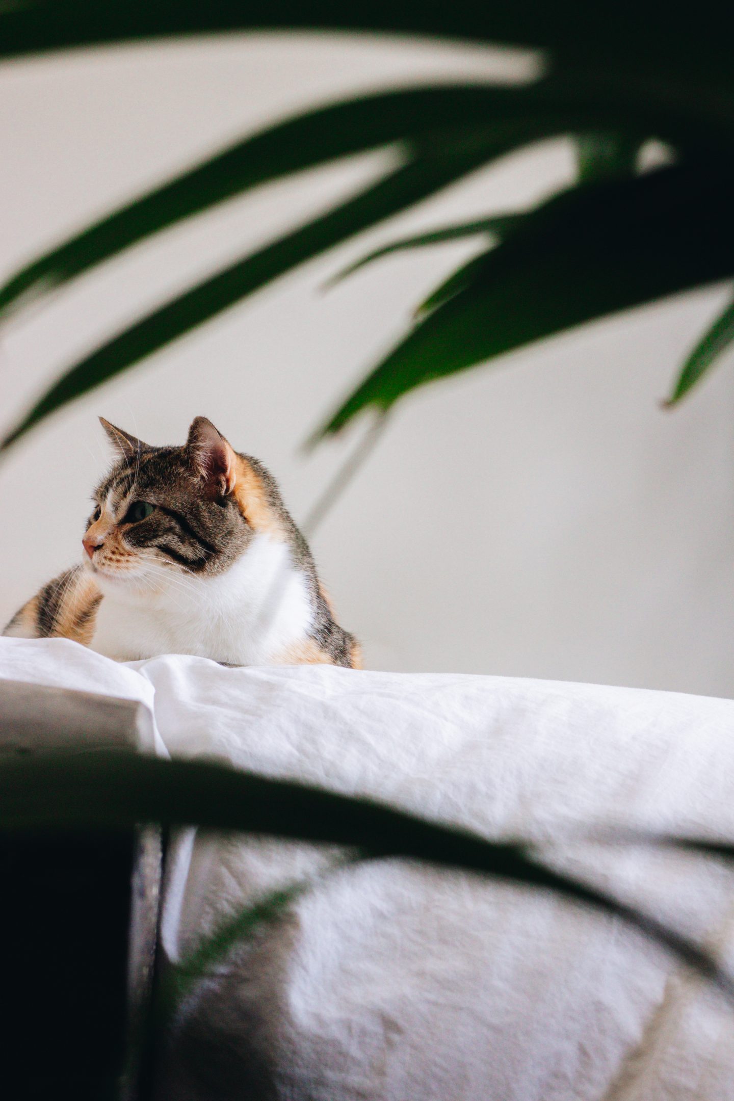
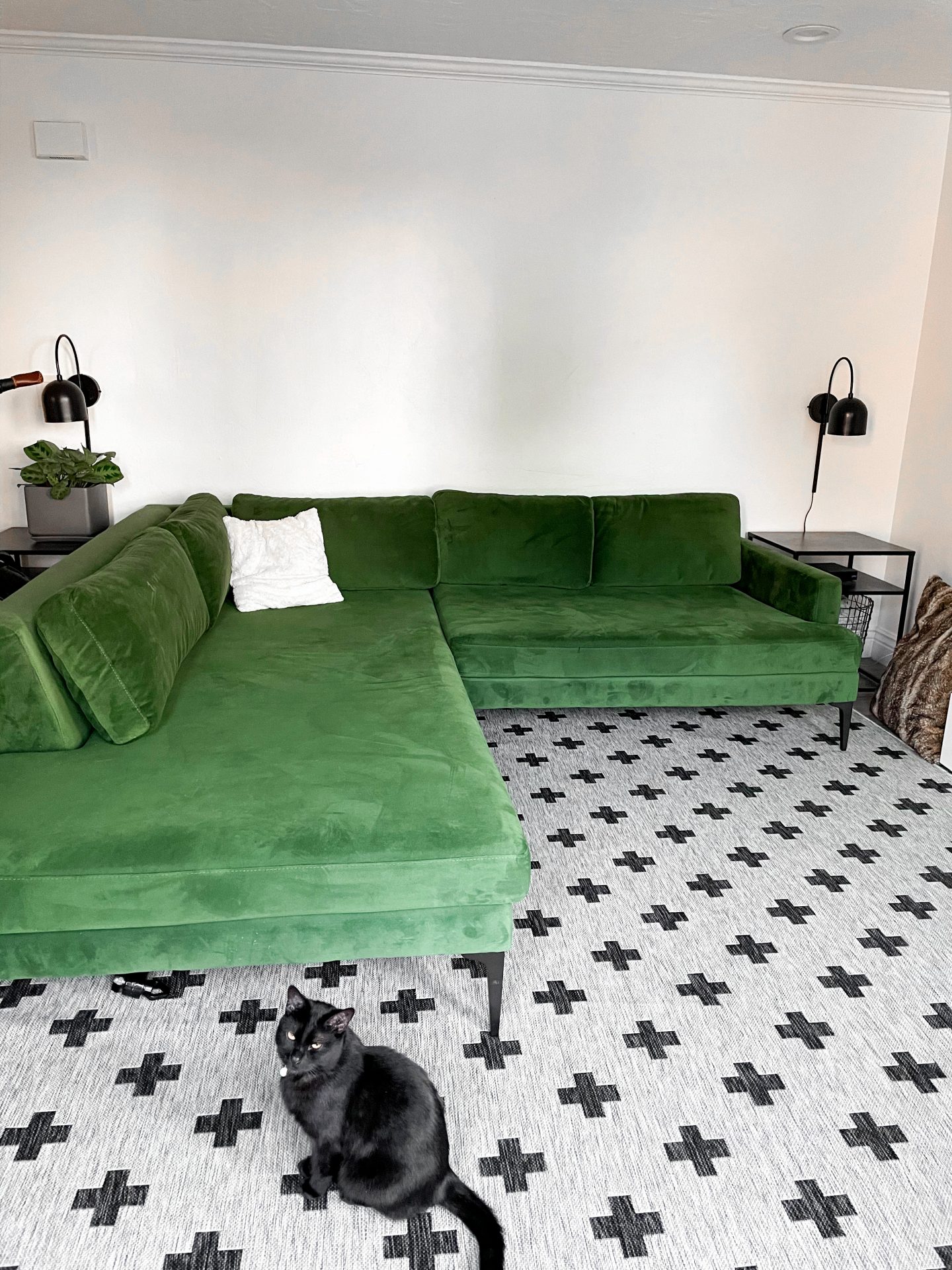
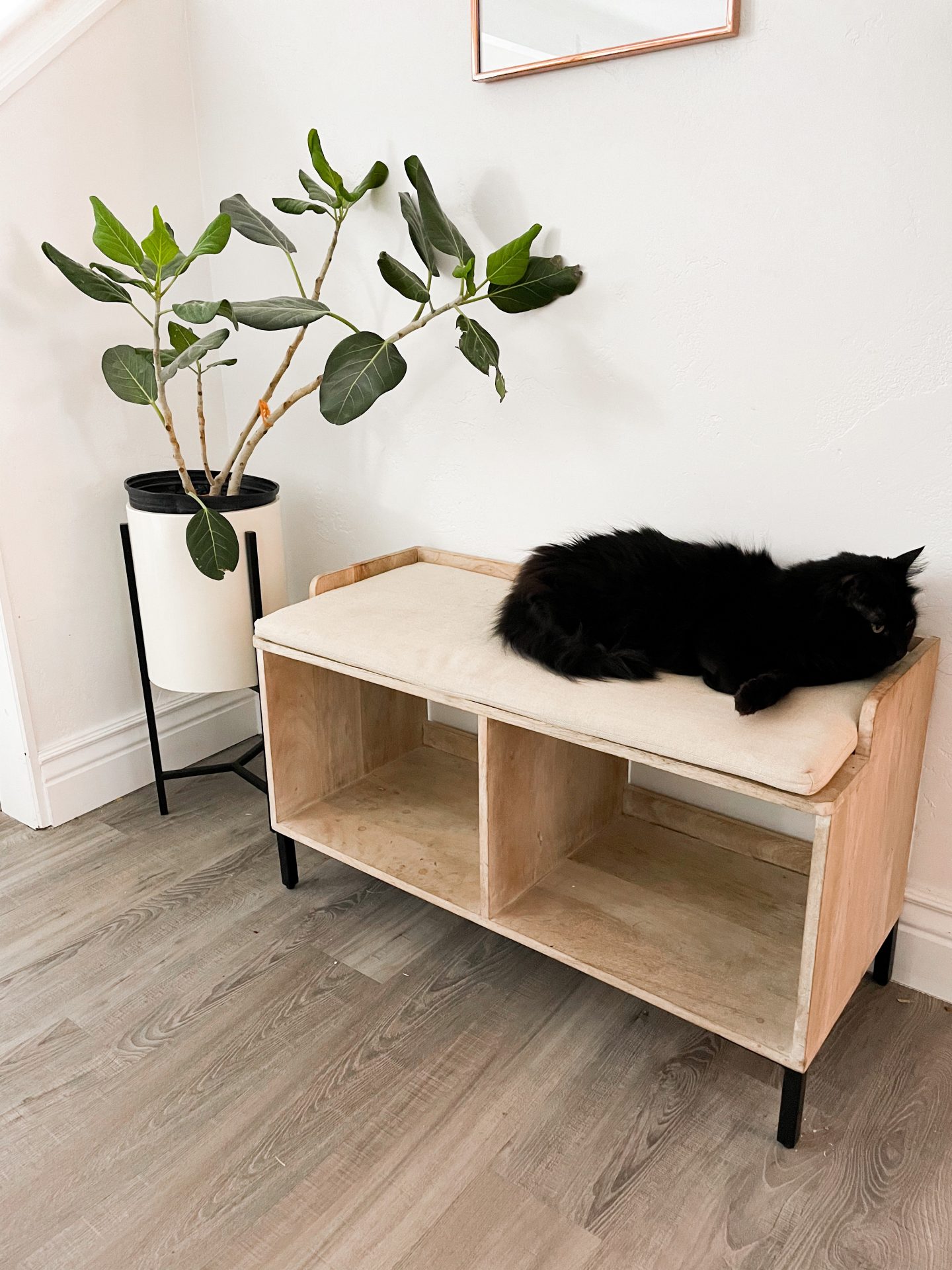
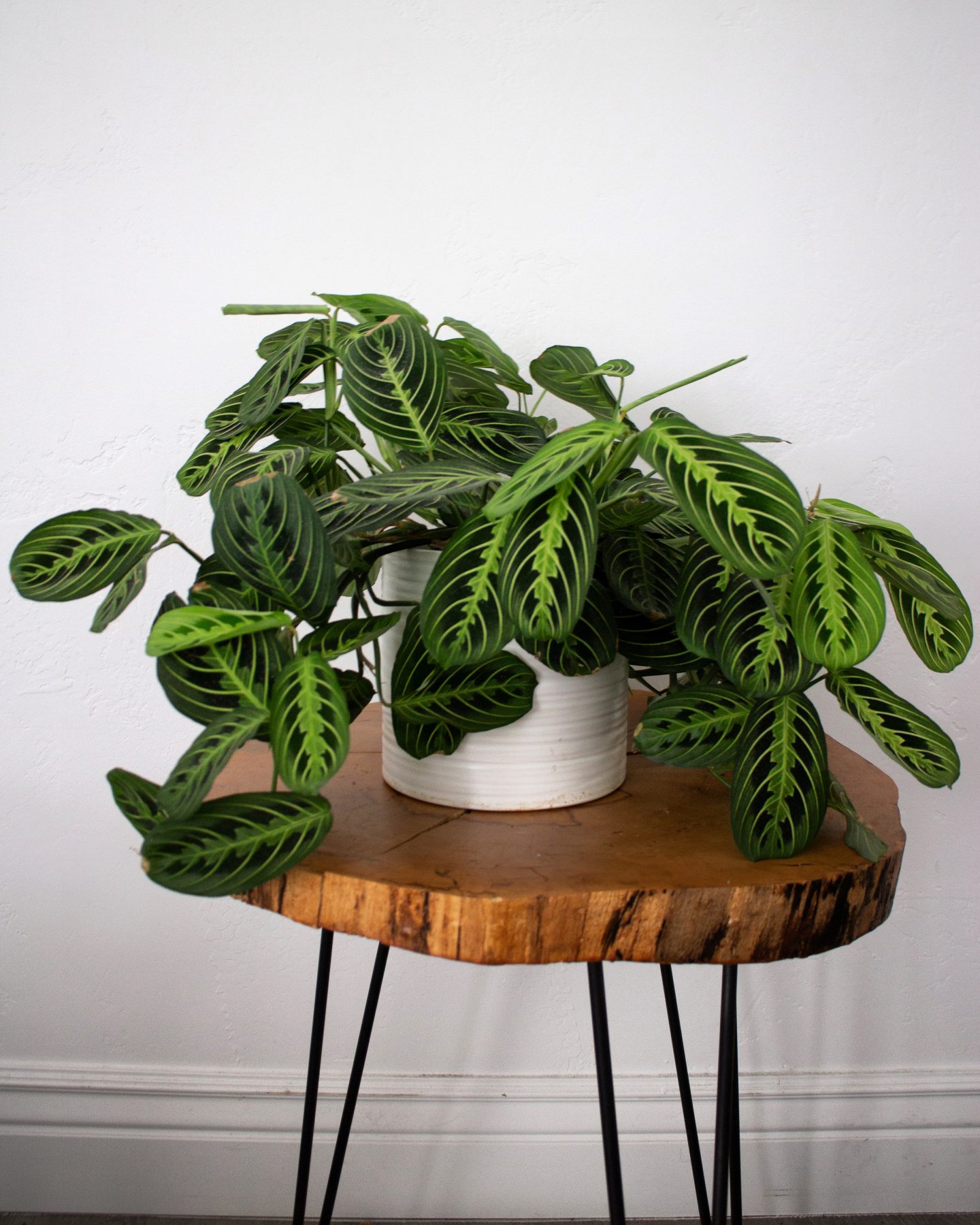
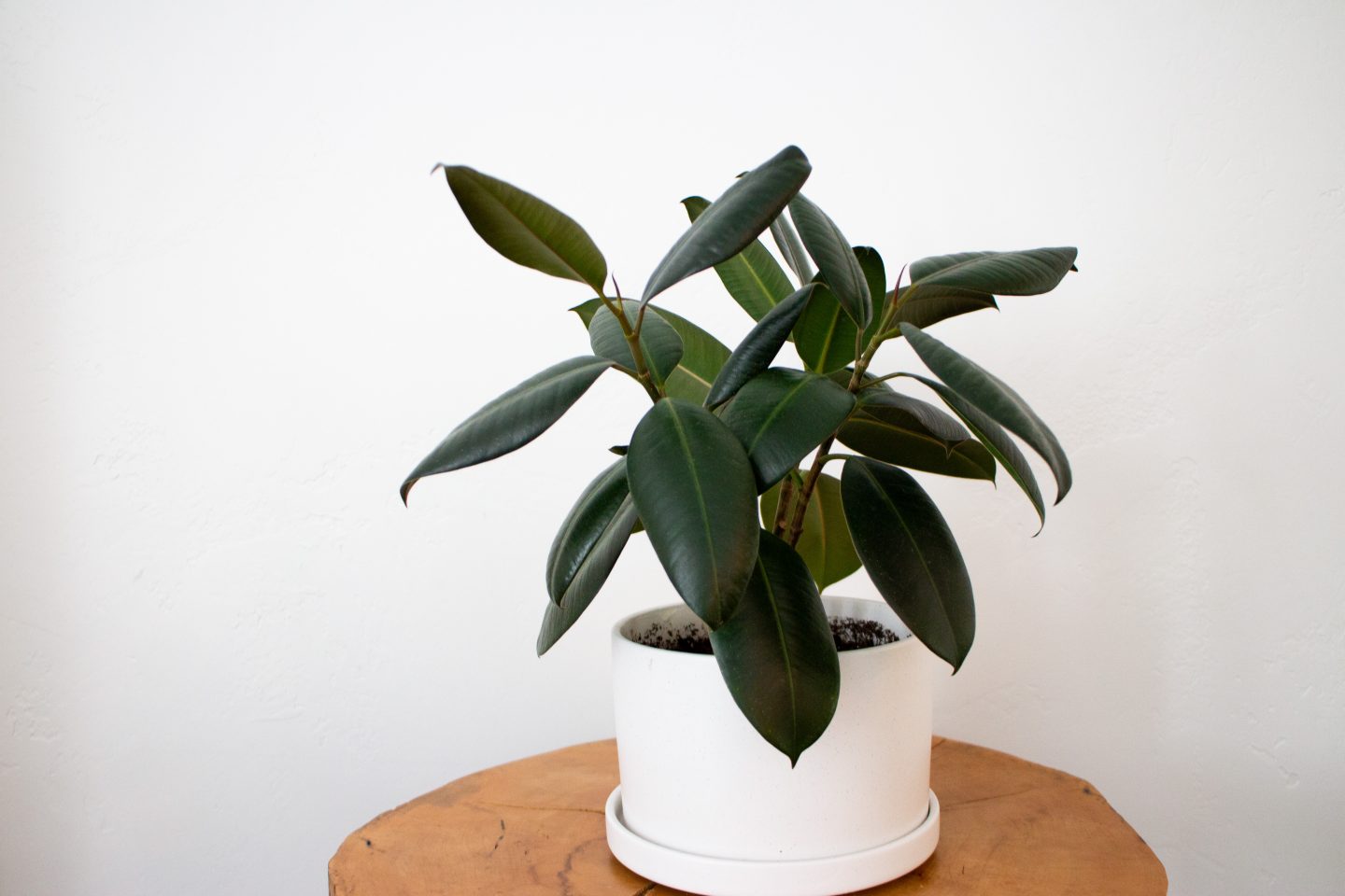
strengthen your color scheme – now that we’ve been over how to get the more ‘insta look’, let’s quickly cover how to get that beautiful grid, because it is a little more than just slapping a filter on your pictures. See, different lighting will draw out different colors, so it’s good to know what colors you want to have pop (or not, if you’re looking into a more muted palette). Personally, after hours of research, I realized I just loved nothing better than the photo style of our wedding bridals photographer. The colors are rich, and don’t feel edited. I learned that good lighting, and well-balanced shadows give me that look. However, I also have sort of a neutral + green thing going on. So, when it comes to out and about shots with people, I like to look for background and locations that support that. What colors are you drawn to? Maybe check some of your favourite instagram accounts, and see if they have any color style in common. In the end, beautiful pictures are beautiful pictures, and you don’t necessarily need a perfectly-manicured instagram grid to reflect that (I, myself, go through periods where I just stop caring about that)—but I thought I’d put the info out there, in case you are striving for that.
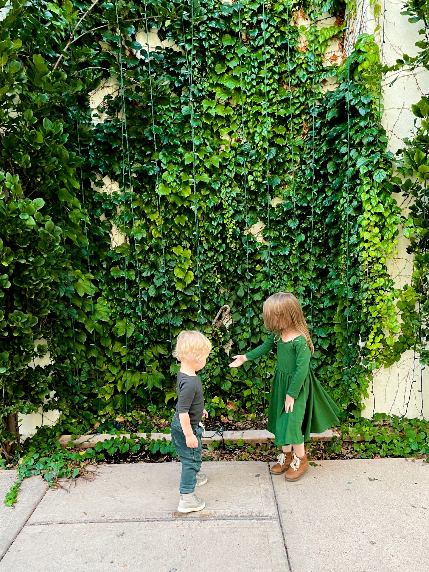

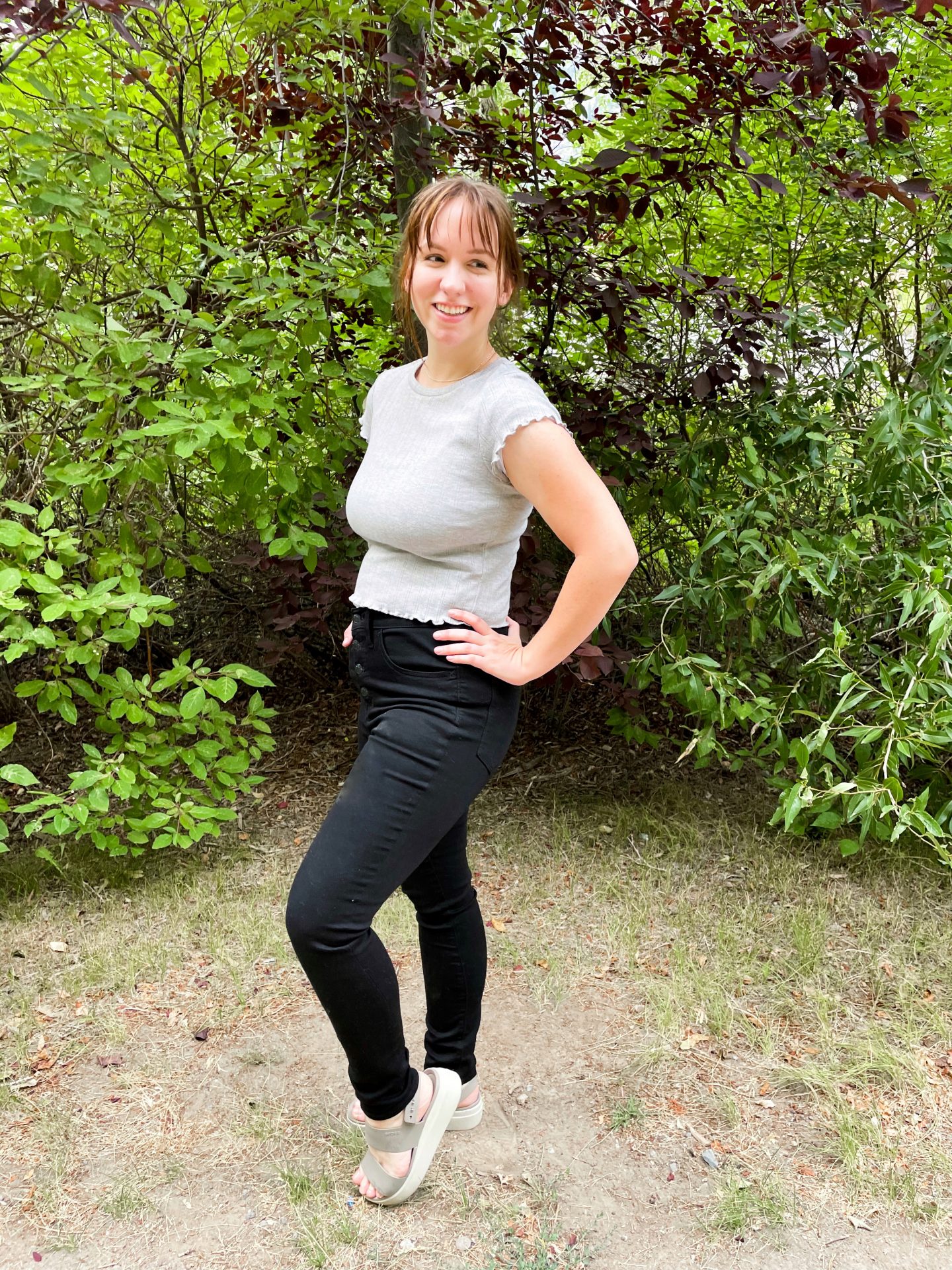
edit – this doesn’t have to be tricky, I promise. I personally use Lightroom for mobile, and Snapseed (which is free). With Snapseed, you can adjust setting so what you captured actually reflects what you see irl (cameras aren’t always great at that). Brightening faces to really make them pop, as well as brightening corners, or removing saturation to get rid of pesky lighting discoloration will both go a long way in making your photos shine. Go ahead and adjust the exposure, but don’t forget how much depth shadows/dark contrast can add, too.

There you have it: anyone can have an instagram house—you simply have to learn how to capture it.
